How to create really great gallery walls
How to create really great gallery walls

Eager to get happy at home right now?
Get 10 tips for a happier home!
Gallery walls are awesome! They’re a great way to fill a giant blank wall anywhere in your home, or to balance a large piece of art on the opposite wall.
But how do you create a successful gallery?
As I built the gallery walls in my home and our office I took note of my favorite takeaways to share with you here! Use these guidelines, but please don’t be afraid to experiment. There are key ingredients that go into any great collection, but in the end, it’s an art as much of a science.
And if you get stuck, remember that you can always hire someone to help!
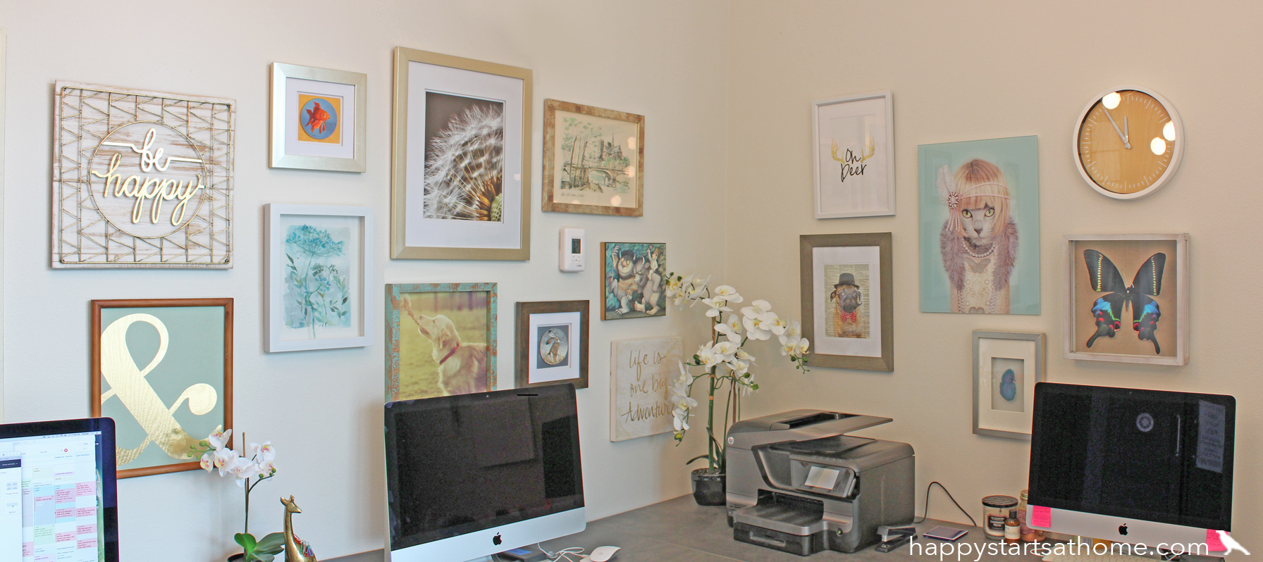
My gallery wall guidelines:
#1 – Treat the whole collection as one piece of art.
Hang the grouping so that the center is at about 60″ from the floor, just like you would with one large piece of art (generally, you want to be able to look into the center of your art while standing). This is true whether it’s a small collection or one that goes nearly floor to ceiling.
#2 – Avoid the urge to hang the biggest piece in the center.
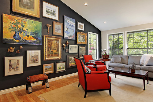
Instead, hang it a little off-center. This will help you create a more interesting layout. In this gallery (below) by Slater Interiors, the designer created a more dynamic collection by offsetting the largest pieces and balancing them with smaller pieces that have more ornate frames. Note that this *isn’t* a hard and fast rule, and many wonderful gallery walls have a central large piece, but it often ends up feeling a little bland.
#3 – Keep the spacing relatively consistent between pieces.
I usually have 3-5″ of space between pieces of art. This ensures that you don’t end up with any lonely pieces floating out on their own, or any pieces that are too crowded into the space. This is more important than making sure the top or bottom lines are straight, because that spacing is how you make it feel like one cozy family of images. See how consistent the spacing is in the gallery below, and how the installer created a straight bottom line, but left the top line organic? Lovely!
#4 – Restrain your palette.
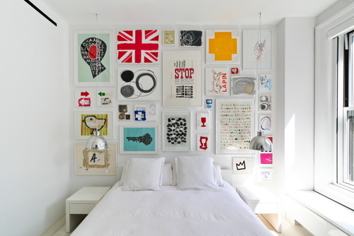
An easy way to make a gallery wall feel cohesive is to keep the art, or the frames, or some element consistent, like using all matching frames, or make the subjects all of similar size. In the gallery below they use all white, skinny frames, beautifully tying all the elements together. In addition, the colors in the art are all bright and clear with a lot of white space, so they feel like cousins from the same family.
#5 – Don’t be afraid to mix up the subjects and textures.
Here the quotes and text break up the portraits and paintings to help keep it interesting and add playful sass.
#6 – Consider painting a deep wall color behind your gallery.
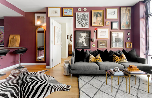
This is especially helpful if you have a really varied collection with lots of different sizes, shapes, textures, and frames, and you want to tie it all together. Of course it also adds quite a lot of personality to a room, like the plum color in this room captured by Rikki Snyder.
Like I said earlier, these are guidelines!
If you’re a planner, it’s okay take some time and lay out your collection on the floor before you hang it on the wall, or consider using blue tape to map out your plan to scale right on the wall. On the other hand, if you’re not afraid of putting a few extra holes in your wall, just start hanging and have fun!
If you need some extra pieces (or if you are starting from scratch) hit the bargain stores like Home Goods, Marshalls, and Tuesday Morning (Pier 1 and World Market have some great pieces too!).
Only buy things that make you smile, and buy more than you think you’ll need – you can return what you don’t use. Be *super* careful to hold on to those receipts – Home Goods has a particularly strict rule about returns without receipts. You don’t want to end up keeping what you don’t need and running over budget as a result!
And finally, check out the gallery wall at our office! Can you get enough of our llama print?
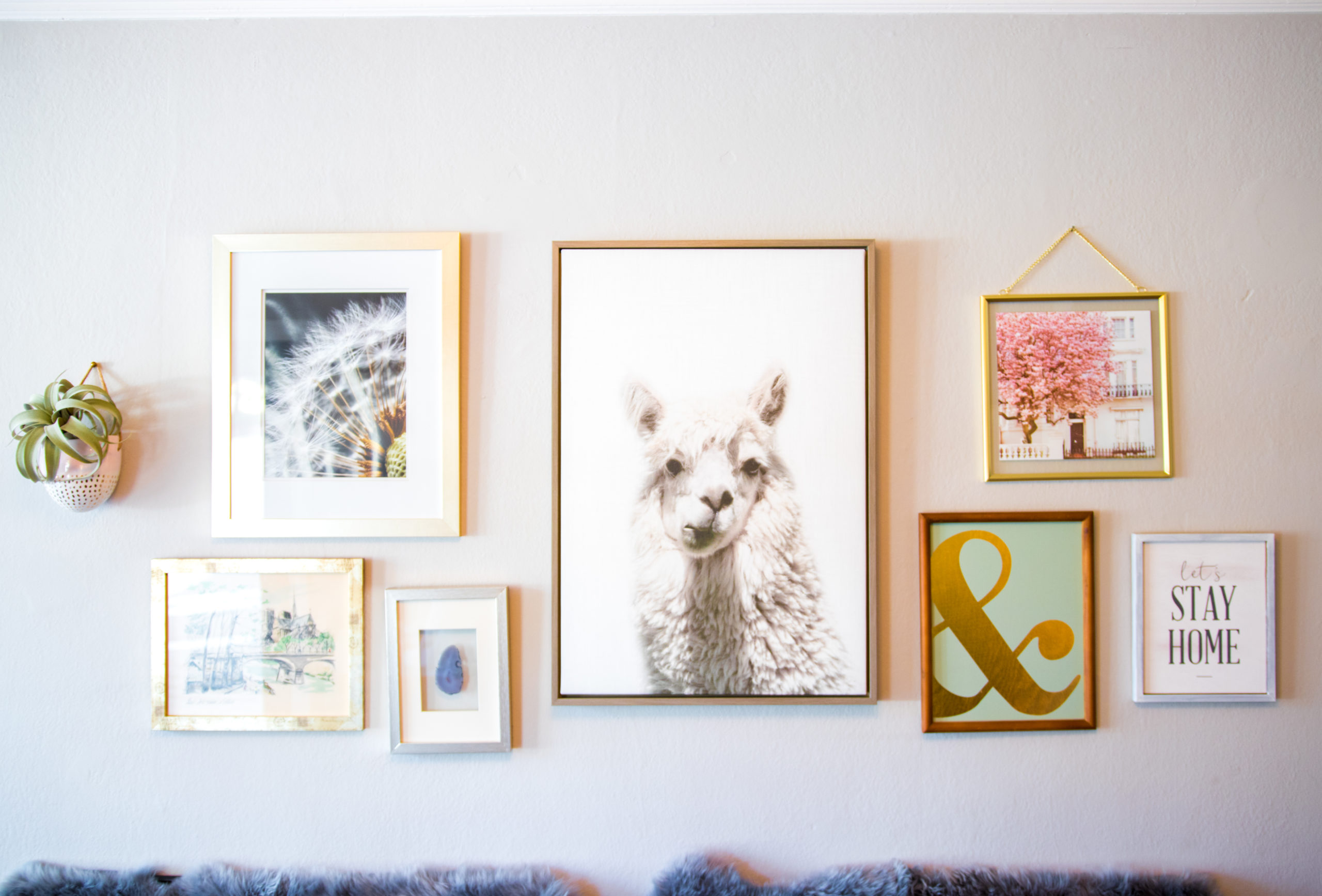
Need a hand with your own gallery wall? Maybe you have a bunch of things on hand that you love but don’t know how to arrange on the wall? Don’t hesitate to give us a holler! We can spend a Design Helpline guiding you on layout, spacing, and hanging heights. We want you to love your collection as much as we love ours!
May your home (and your Gallery Walls) always be happy!


HI, I'M REBECCA WEST!
I’m an interior designer, author, podcaster, speaker, and coach to other designers. (Whew!) But I’m not your classic interior designer because, frankly, I don’t care if you buy a new sofa. I do care if your home supports your goals and feels like “you.” Remember, happy starts at home!
More From Seriously Happy Homes
Are you ready for a seriously happy home?
(Cue the confetti!)

Eager to get happy at home right now?


