One Kitchen, Three Baths, & an Octopus!
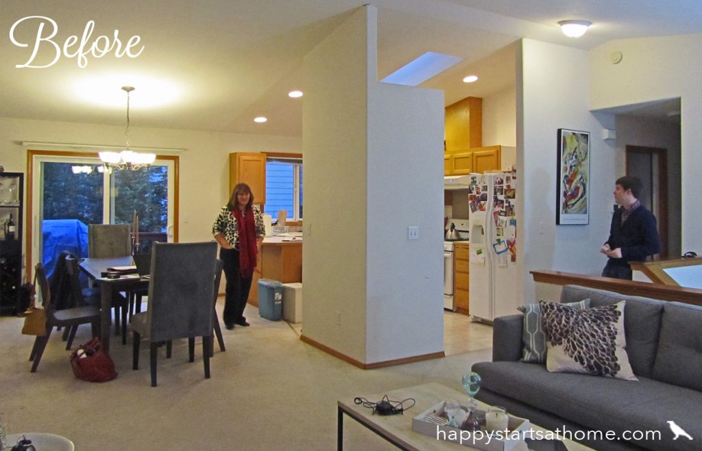
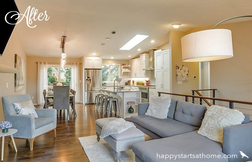
You know how sometimes it just seems like something is in your way, and when you finally clear out that obstacle everything feels more open, light, and airy? That’s exactly what happened with this space.
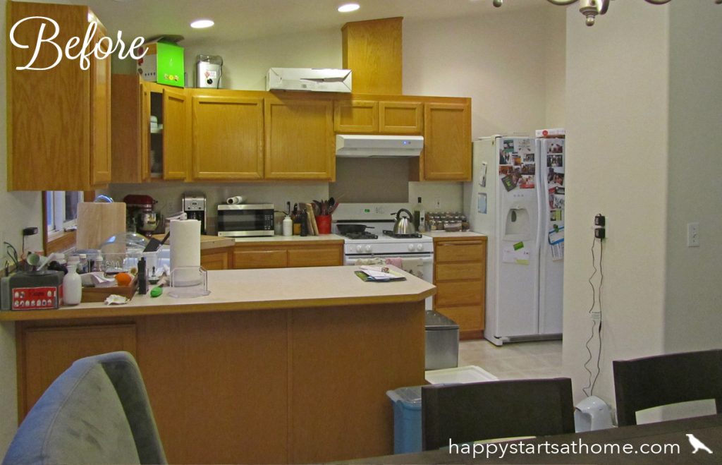
The nicest couple (dare I say – in the World?) bought this split level home and wanted an update that would make the kitchen live larger and make the whole space more entertainment-friendly. It wasn’t a bad layout to start with, but it had a massive closeted pantry dividing the kitchen from the rest of the room. It was time for that to go!
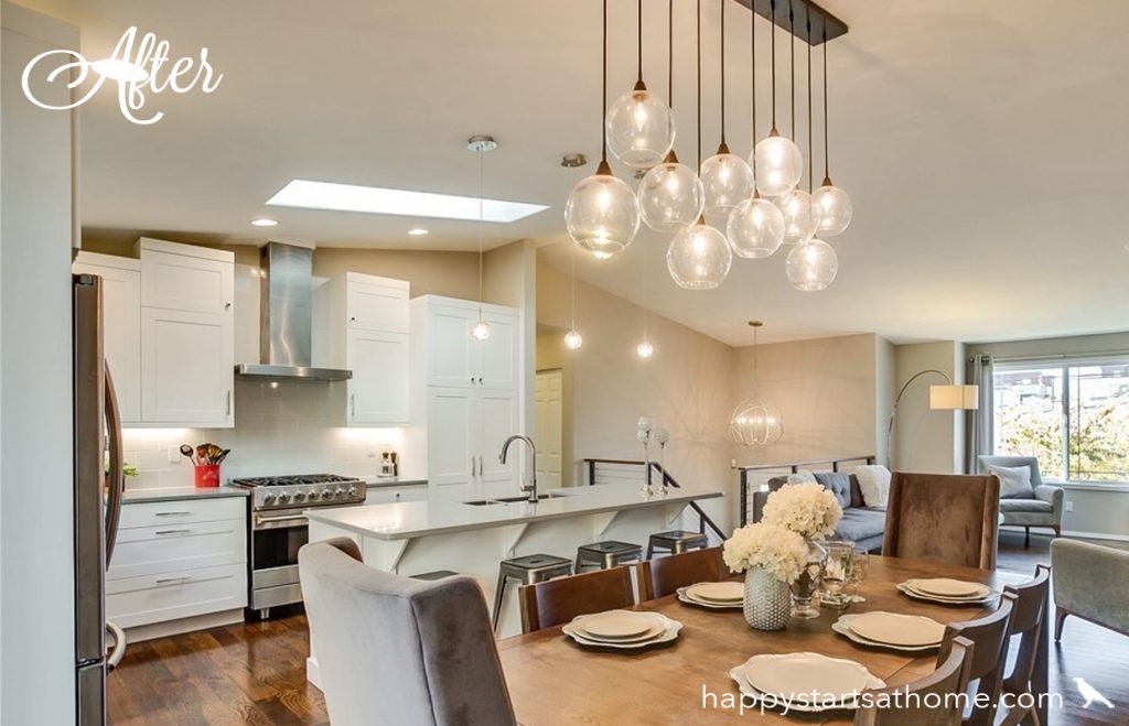
So we created a design plan that busted out that big partition, and replaced it with a generous, open island with bar seating, perfect for throwing a party or raising a family!
Of course, the materials – oak cabinets, laminate counters, and vinyl and carpet floors – were also holding the room back in the 80s and making it feel more like a generic rental than this family’s home.
So we replaced that golden oak with bright white shaker style cabinets, laid wide-plank farmhouse style wood on the floors, and finished the space with modern light fixtures with soft lines. The combination of bronze and nickel created a friendly, eclectic look that perfectly suited this family’s love of things both vintage and modern.
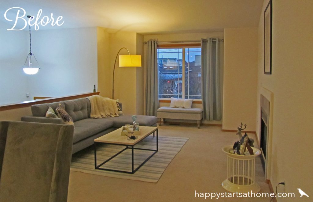
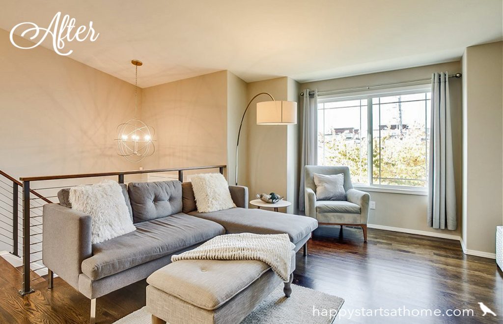
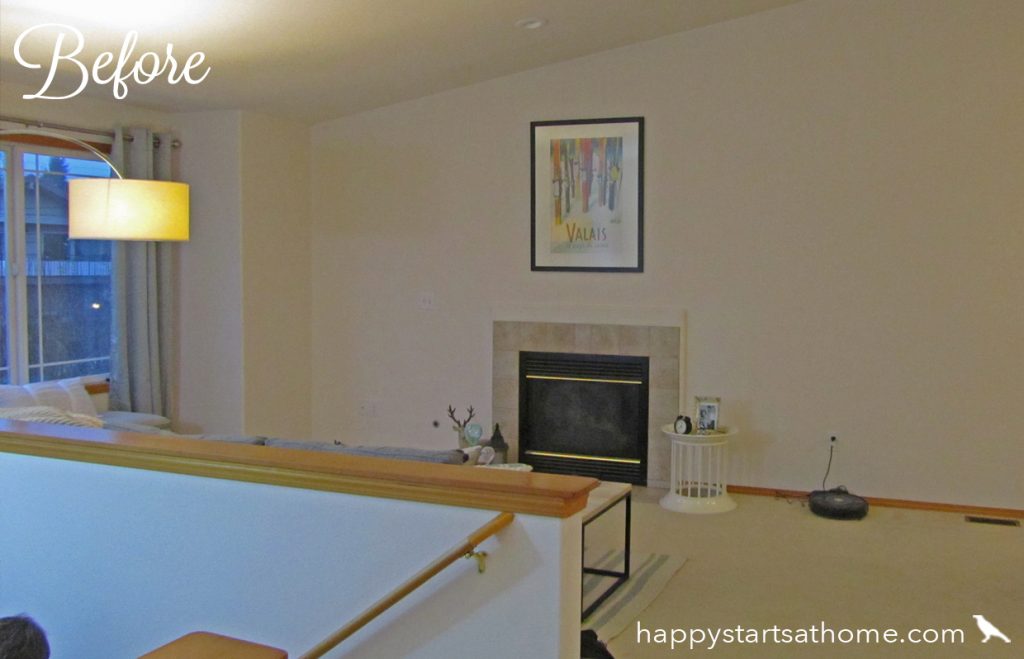
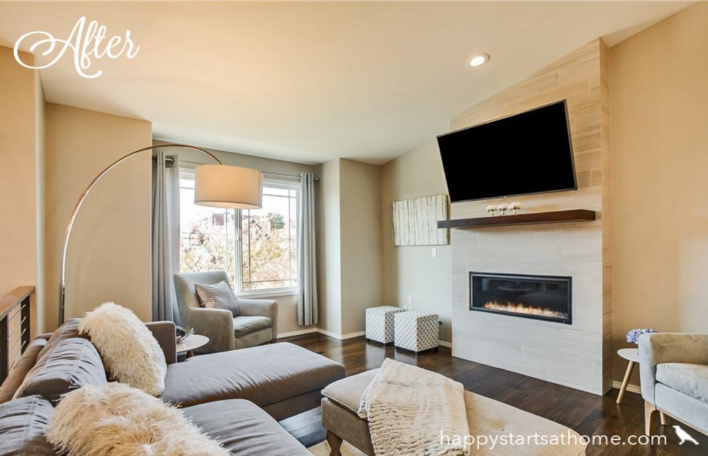
Across the space in the living room the clients wanted a much more interesting fireplace, more unique lighting and, again, a more open, connected feeling.
The answer? A modern cable-railing to replace that blocky pony wall, and a fantastic orb-style light over the entry.
And to dress up that flat, neglected fireplace they installed a long, linear fireplace insert and we paired it with with nature-inspired travertine-style stone, installed not only floor-to-ceiling for more design impact, but also built out from the wall to give more depth and dimension.
But wait, there’s more!
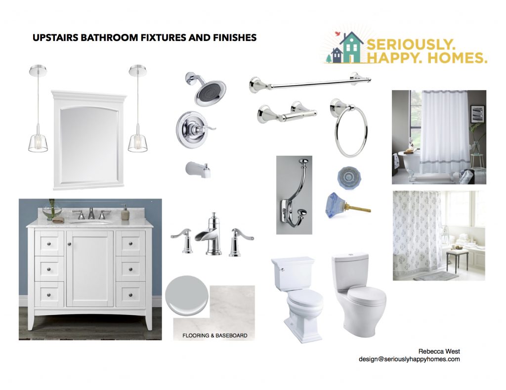
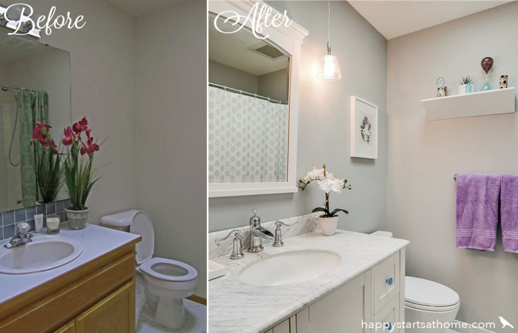
This home also had three bathrooms still stuck with contractor-grade 80’s finishes. In the first bathroom the client asked for a bit more vintage flair, while still keeping it cohesive with the main spaces. Here is the design board we put together for them:
And here is the before and after on that space:
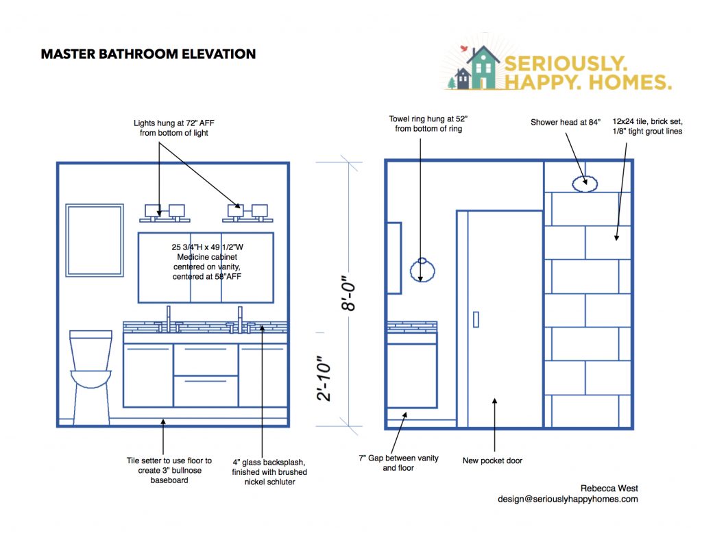
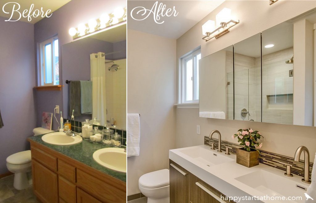
Meanwhile, in the master bathroom, they asked for a more streamlined, modern design that would make the space feel as big as possible. We opted for simple, oversized tile in the shower and a floating vanity to increase the feeling of lightness and openness. Here is an elevation we created for the contractor to follow:
And here is a before and after of the master bath:
Finally, in the basement bath, they wanted a simple, cost effective update that would add a lot of personality to the space. So we kept the tub/shower surround and toilet, but updated the floors, vanity, mirror, fixtures and accessories, choosing a chrome finish so we wouldn’t have to change the shower trim, and topped it all off with the Most. Fun. Shower Curtain. Ever. (Did we mention that we are serious octopi fans?)
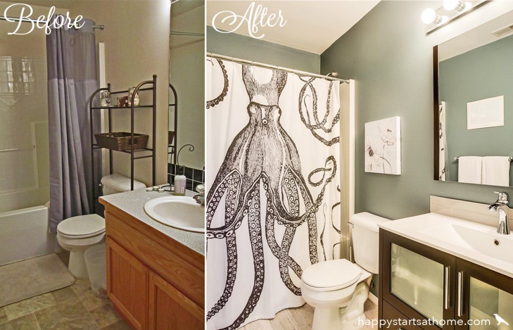
Oh my gosh do we LOVE this little bathroom – it was most definitely the cherry on top of an amazing design experience throughout this wonderful home. We had so much fun and are so grateful that we got to work with such nice people!
If your home could use a little (or a LOT) more personality, we’d love to help! Just give us a shout and we’ll help you figure out just what your house needs to feel like your home. And if you liked this design in particular and you know that our Works service is right for you, ask for Angela – she was the brilliant lead designer on this project, and she would love to help you make over your own magnificent space! ❤ Anyone would be lucky to have her on their team – we know we are! ❤
MAY YOUR HOME ALWAYS BE HAPPY!

Are you ready for a seriously happy home?
(Cue the confetti!)
Eager to get happy at home right now?

