Get a bigger, better bathroom (without moving any walls, doors, or windows!)
Designers know: it’s not the amount of space you have but how you use it that counts! In this case our clients had a nice-sized bathroom but the layout made it feel small, and the giant tub they never used meant that nearly a quarter of the real estate was underutilized!
For this project to feel successful we needed to design a bathroom that would:
-
- Feel more spacious while providing more useful, functional storage
- Feel bright, open, and updated, (goodbye 90’s brass!) *but also* organic and rich
- And, of course, be easy-to-clean (a must for all our clients!)
Aesthetically it was important that we balance *his* desire for a clean, uncluttered space that wouldn’t feel too busy with *her* craving for a friendly, textural space that wouldn’t feel too sterile.
We started by figuring out a new layout, getting clever without moving any doors, windows, or walls:
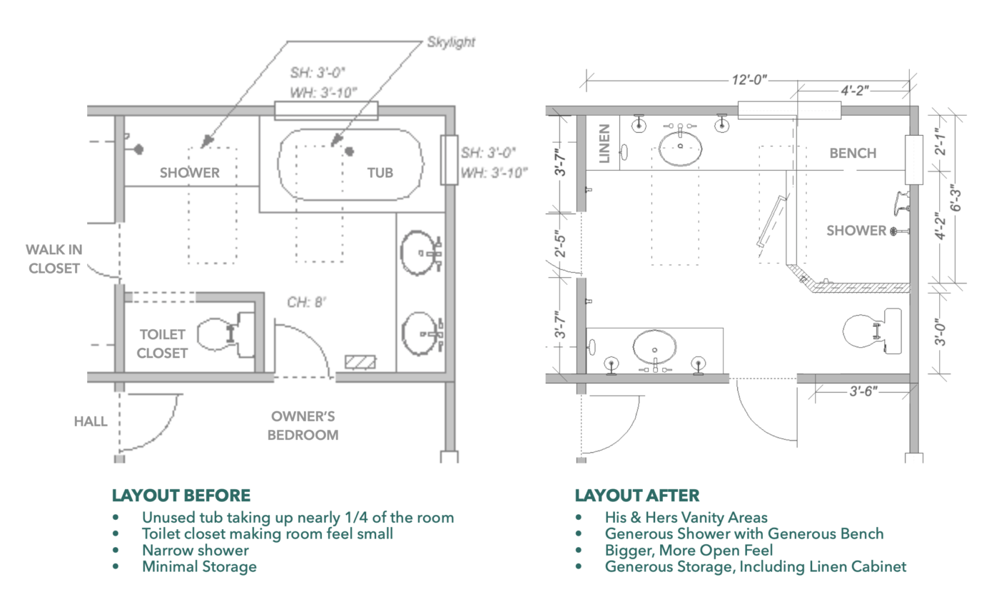
Here’s what the room looked like before we started – look at all that space that tub was taking up! 😳
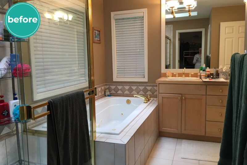
And here’s that same view after!
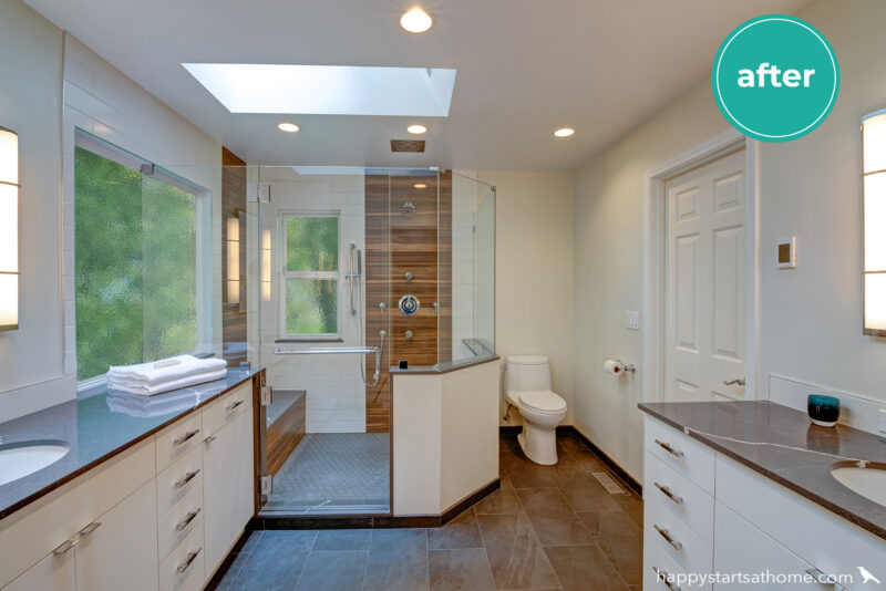
The trickiest part was accommodating that picture window – but it turned out that we could just intersect the shower glass with the window glass. In fact, since the shower head was more than 4 feet away from that glass-to-glass intersection there wasn’t even a need to silicone between the two panes of glass! Hurray for big showers!
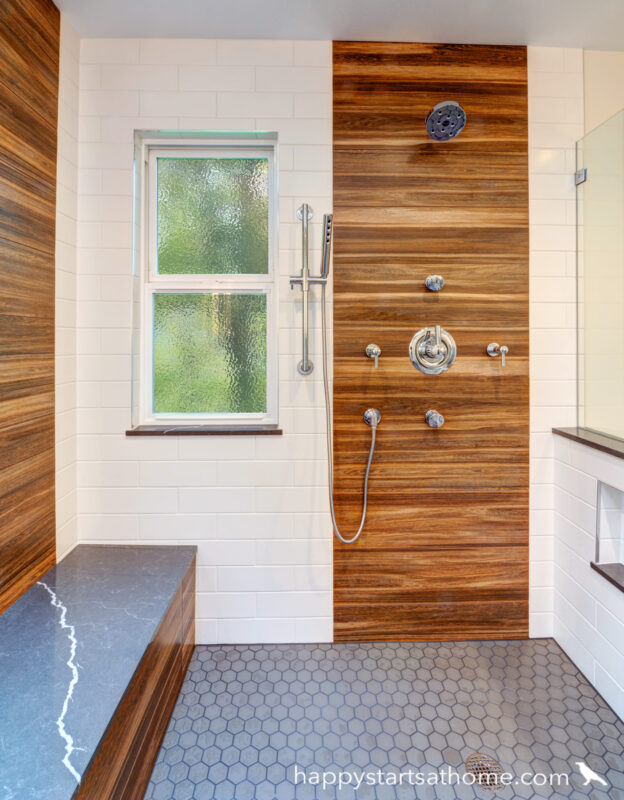
Once we nailed down the layout it was time to balance out his need for a clean, bright, uncluttered look with her need for a room that would feel warm and textural rather than sterile and cold. We used simple slab-front white cabinets, white wall tile, and bright neutral wall paint for him, then anchored the room with stone-look floors, dark marble-look quartz for the counters and bench top, and the most stunning wood-look feature tile for her 👉
(PS – do you see that peek-a-boo of a niche in the pony wall on the right? That’s a sneaky way to get convenient shampoo storage without having clutter disturb the feel of the room! 😀)
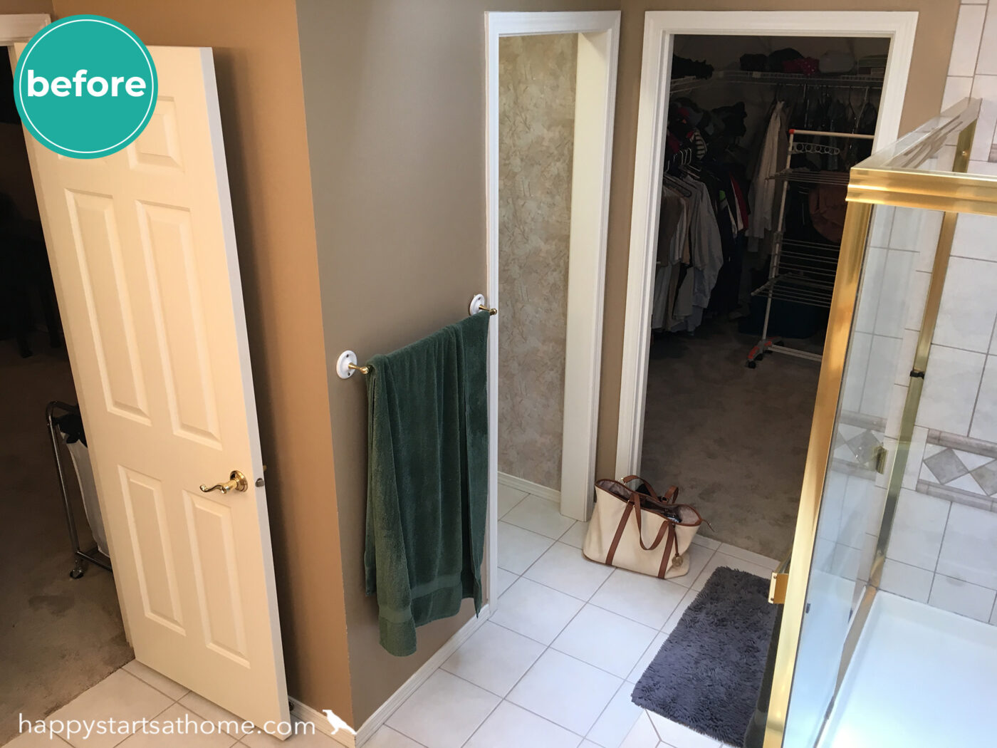
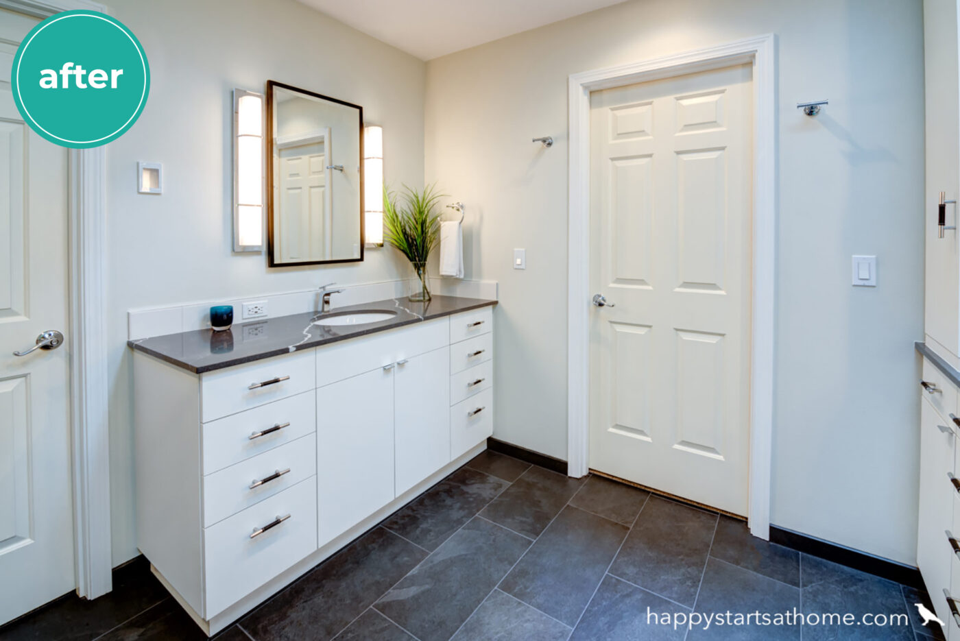
On the other side of the room we eliminated the toilet closet and moved the toilet next to the shower. This gave us lots of room to add a second vanity (they both wanted plenty of elbow room and lots of storage!!)
Here’s that toilet-closet corner before:
Replaced with a generous vanity after:
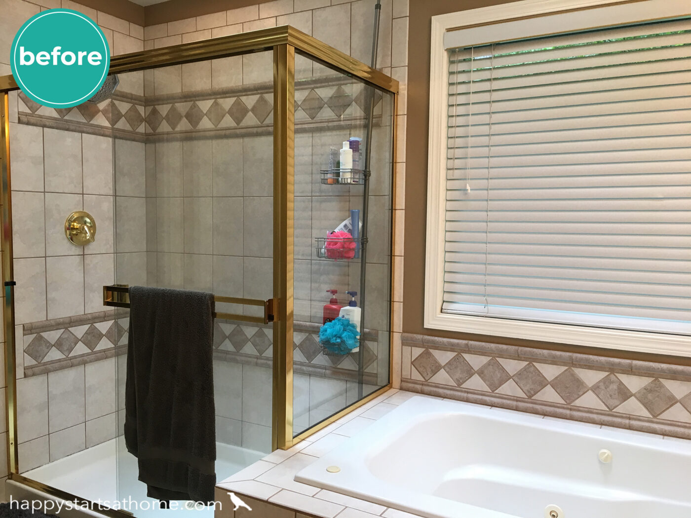
Opposite that vanity we used the old shower location for a second (huge) vanity and linen closet!
That shower corner before:
And that massive custom vanity and storage, after!
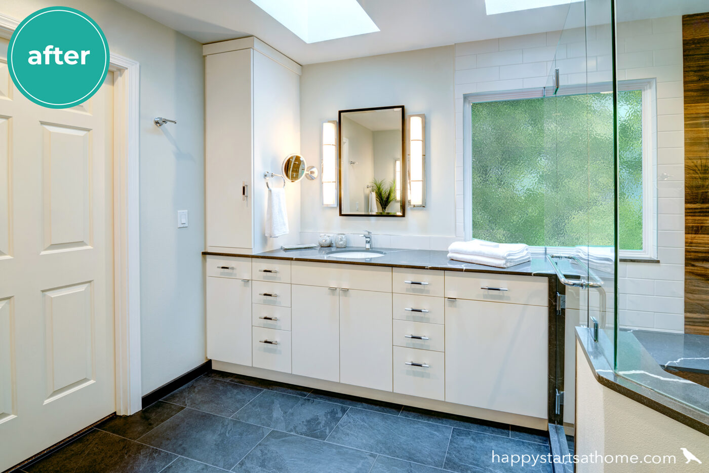
All that without moving a single wall (unless you count demo’ing the toilet closet) or window – wahoo! A big shout out to the folks at Palmer Residential for making this bathroom dream come true!
Have an outdated bathroom with a poor use of space? We’d love to help! Let’s see if we can make your home work much better for you and your family! 🎉
MAY YOUR HOME ALWAYS BE HAPPY!

Are you ready for a seriously happy home?
(Cue the confetti!)

Eager to get happy at home right now?
