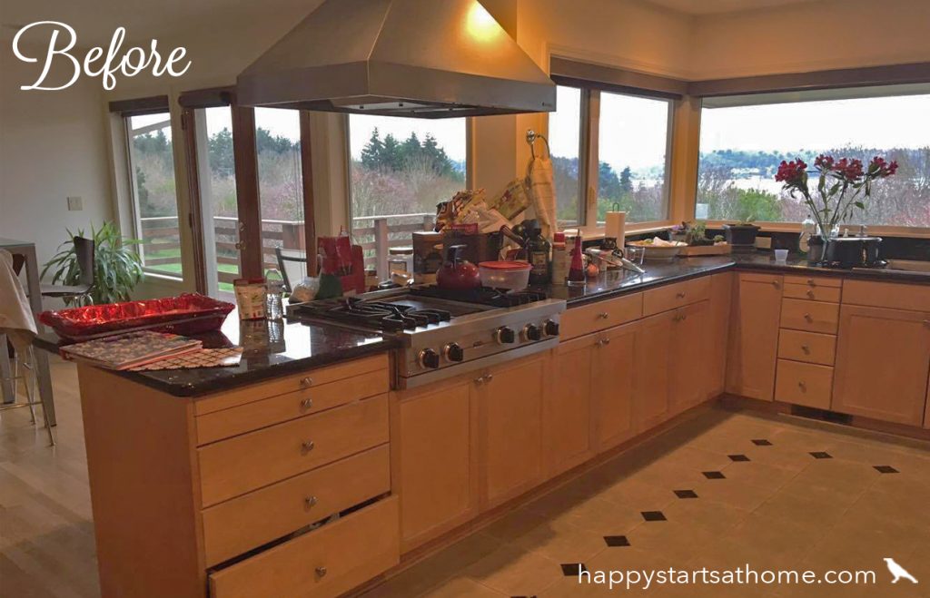
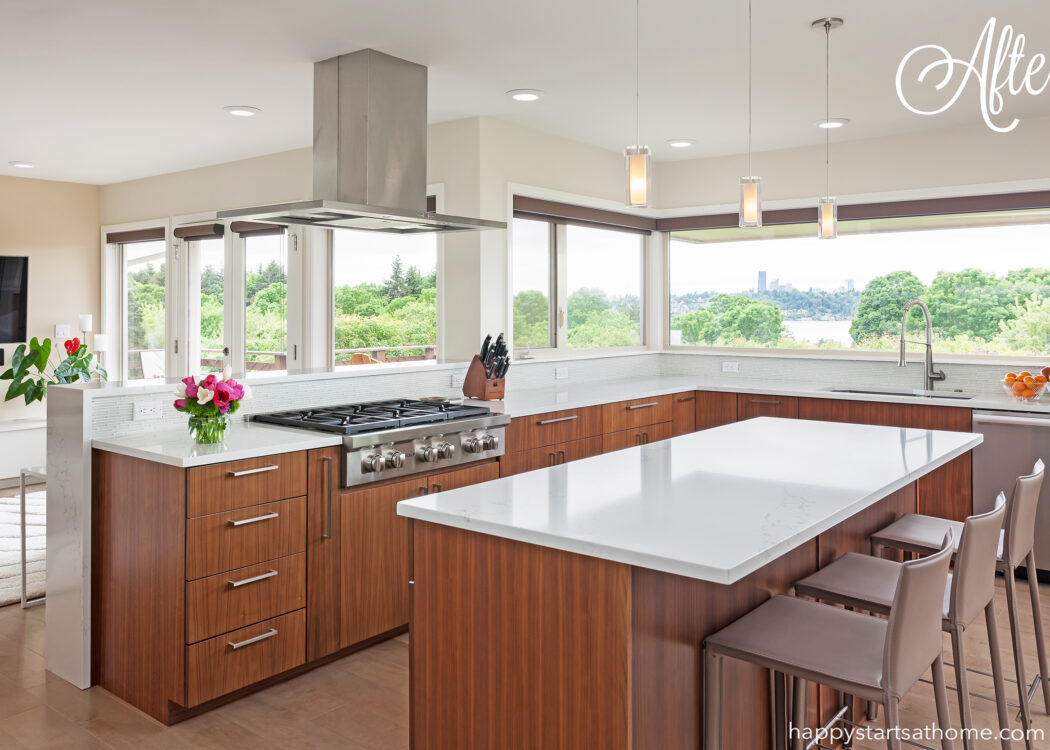
Cooking Up A Modern Entertaining Space
When we met the lovely lady who lived in this Mercer Island home, we learned that she’d moved five times in the past six years! She was ready to put down some roots and finally have a place to call home! Her goal was to create a stylish, modern space where her family and friends could gather and relax and just get away from the stress of life and work.
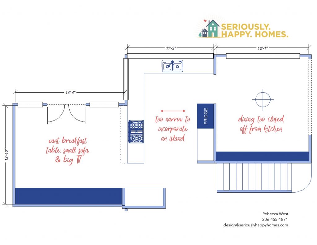
For this project our job was primarily to work on the layout of the new kitchen and dining room. The client had fantastic taste and chose the delicious materials on her own, just running them by our team for a bit of guidance here or there. The layout challenge? She wanted an island, with seating, in a kitchen that was *technically* too narrow. She also wanted a secondary seating area that made the most of the view, a large TV that could be seen from any where in the entertaining space, and she wanted to improve the connection and flow between the spaces. This was the layout when we started:
 And here below using the slider, you can see the space when we first visited – rather heavy and outdated. And how different it looks now!
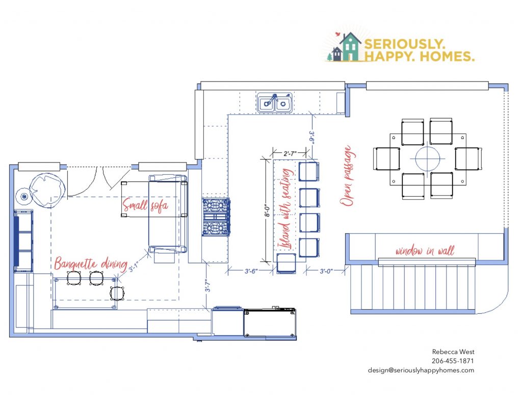
Our solution? Remove the fridge and cabinetry from the dining room wall completely and move it to the wall at the end of the peninsula. That not only let us open the wall to the dining room as wide as possible, it also gave us *just* enough space to get away with having an island with bar seating. To increase the connection between the rooms we also added a big opening to the stair-wall in the dining room, so now when you walk in the house you immediately see through the the beautiful view. In the lounge area we we able to give her both the breakfast table and the small sofa by building the breakfast table into a banquette, and protected the folks sitting on the sofa from any stove splatter by raising the height of the back of the peninsula to provide a backsplash:
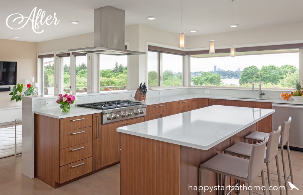
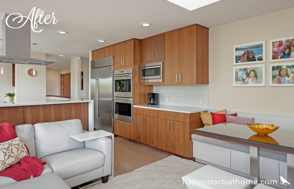
Here is the amazing transformation: light, airy and open with comfortable island seating and an unobstructed view of the city and the TV!
Below is a “before” shot toward the family lounge area – you can see that the bulky existing built-ins (along with the brown floors, brown cabinets, and black counters) made the room feel crowded and heavy:
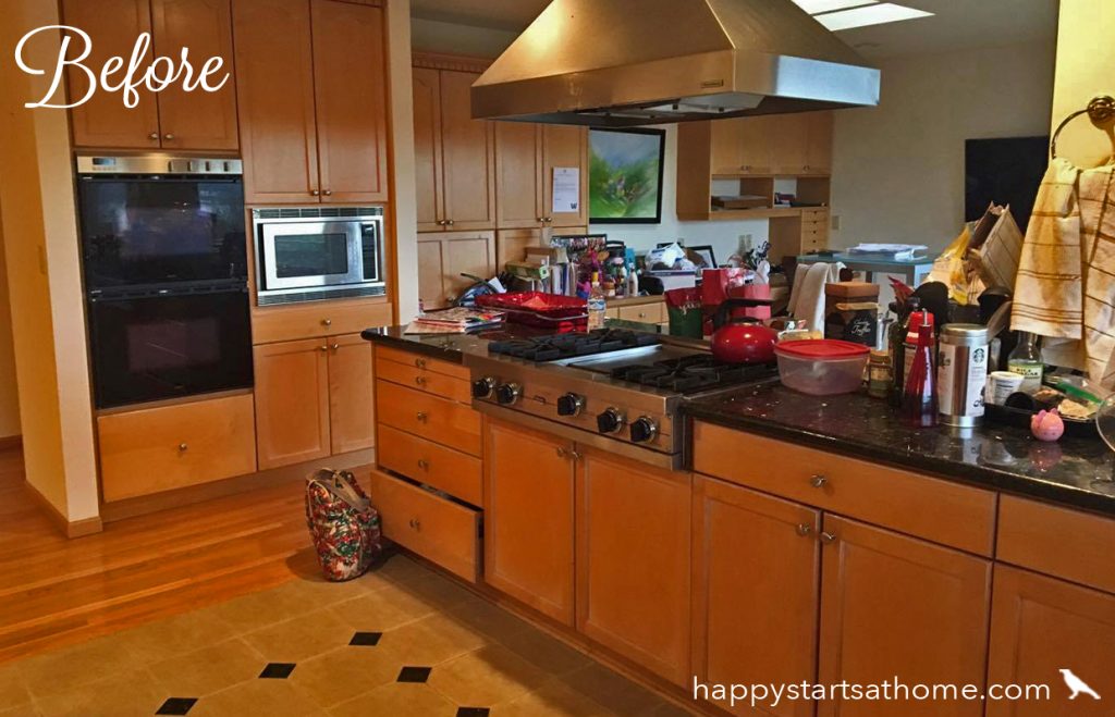
Afterward, the whole room feels SO much more bright and open! Notice that not only are the built ins less bulky, but we also painted the lounge/banquette built-ins white to distinguish that area from the kitchen and make it feel lighter and more open. Of course the wonderful white counters, more streamlined vent hood, and reflective appliances also make a HUGE difference!
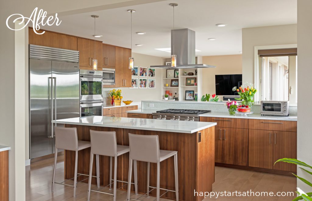
Below is a “before” shot standing in the family lounge looking back toward the kitchen. Notice how the bulky built-ins and the skimpy bar seating area crowd the other furniture:
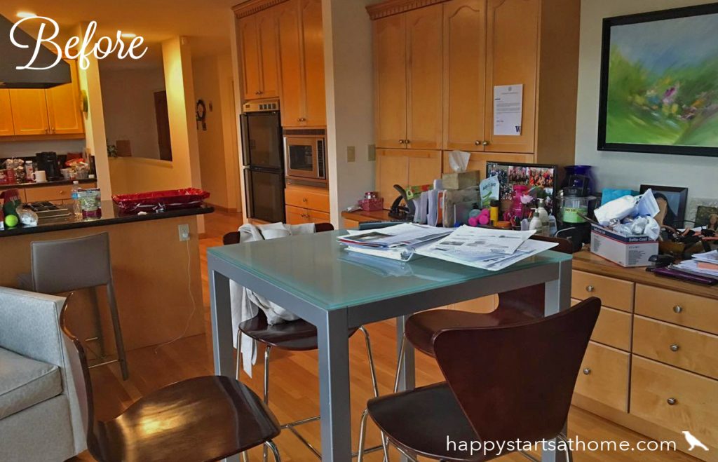
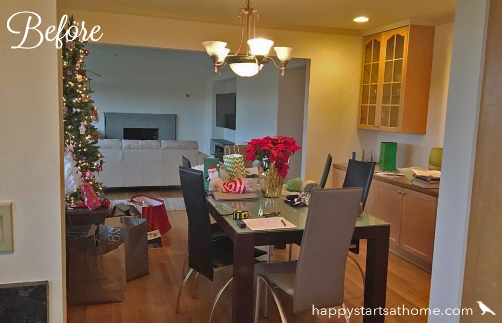
Finally, a shot standing in the kitchen looking into the dining room. Before, it’s open to the living room on the far end, but closed off from the kitchen or the entry.
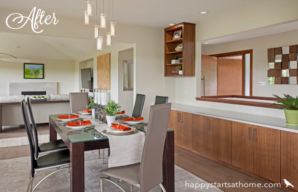
After, the opening to the kitchen matches the opening to the living room creating a magnificent and inviting entertaining space, and the opening in the stair wall (on the right) lets you see to the entry. That means you can greet new guests coming in for a party with a smile and a wave, and they can see right through to the stunning view out the dining windows.
This remodel was a remarkable success and a wonderful collaboration between our design team, the client who had an impeccable eye for the materials and finishes, and Casey and the fantastic team at Next Level Construction – thanks guys! If you need a bit of professional help to get from where you at to where you’d like to be, we’d love to help! Just give us a shout and we’ll see if we might be a great partner to help make your vision a reality.
MAY YOUR HOME ALWAYS BE HAPPY!

Are you ready for a seriously happy home?
(Cue the confetti!)

Eager to get happy at home right now?

