A Minimalist Condo with a Flair for Adventure
It’s rare that I get to work on a project without having ever met the client, but that is exactly what happened with this sleek little Seattle condo. When the gal who bought this space contacted me, she already had a clear sense of what she wanted. In fact, she’d already bought a number of items and had collected a handful of others that were in her “possibilities” pile. My job would be to help sort through the ideas and make sure that the final result looked cohesive and fit the scale of the space.
The client’s enthusiasm, the fact that she was a single lady moving across the country fro a new adventure, and the delightfulness of the items she’d chosen captured my designer heart, and I took on the project. (Honestly, it was the art she loved that did it, as you’ll see below!)
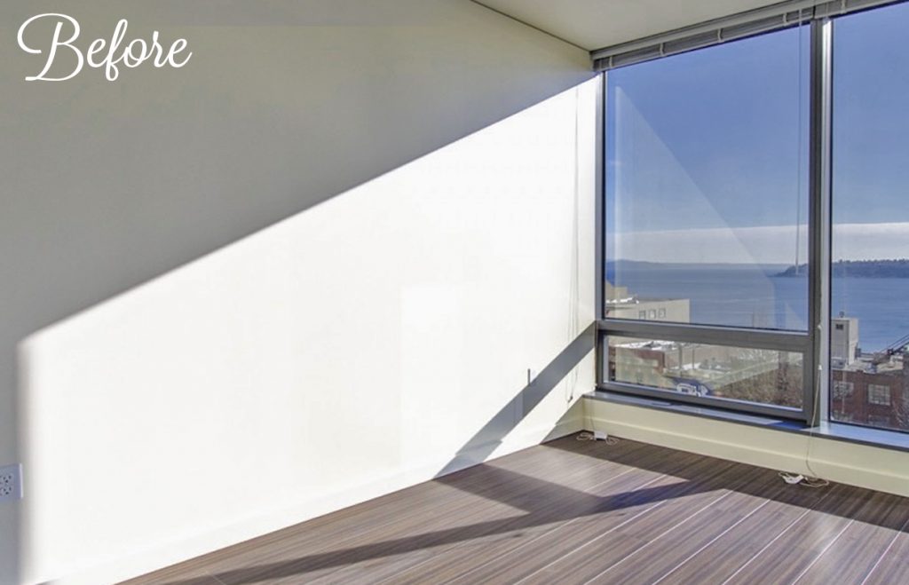
Before we started, the space was like any modern urban condo: bare, white, and minimal. Of course, it also had the most amazing view of Seattle and the water, and no matter what we did, it was important that we not take away from what made it unique!
The trick was to balance the minimalist lines of the architecture, the clean lines of the furniture she liked, the wow-view, *and* bring in some whimsy. She was *not* looking for a generic, anyone-could-live-here space.
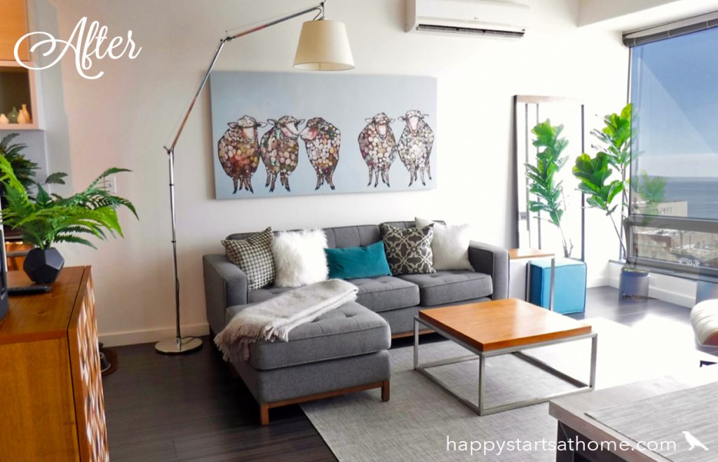
I learned she’s a big fan of Eli Halpin’s work (as it turns out, so am I. If anyone wants to get me a present, her “Baby Llamas” have my name written all over them!) Once I learned that, it set the tone for the playfulness we’d bring into this sophisticated space. The key was to restrain the color palette, letting the content and character of the art set the mood.
On a more practical level, we defined this open-concept room using an L-shaped couch and pet-friendly rug. The leggy furniture keeps it feeling open and airy, while still providing lots of seating and table surfaces.
Lighting was a particular challenge in the condo because the architect hadn’t provided any overhead light. That was easy to address in the living room with a striking arc lamp, but what to do in the dining room, especially with 10′ ceilings and barely enough room for a dining table?
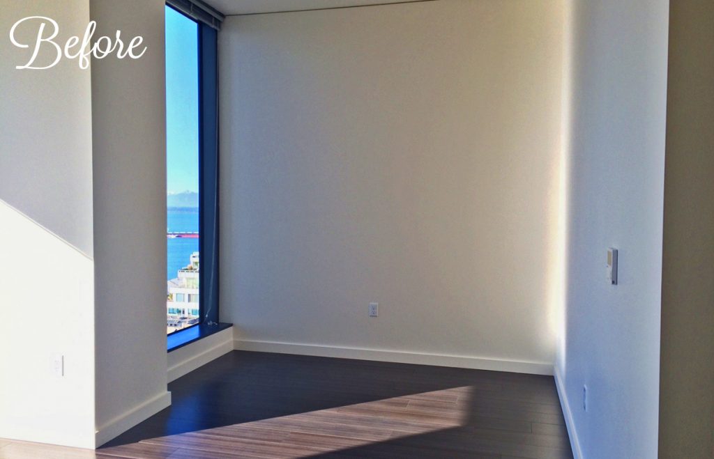
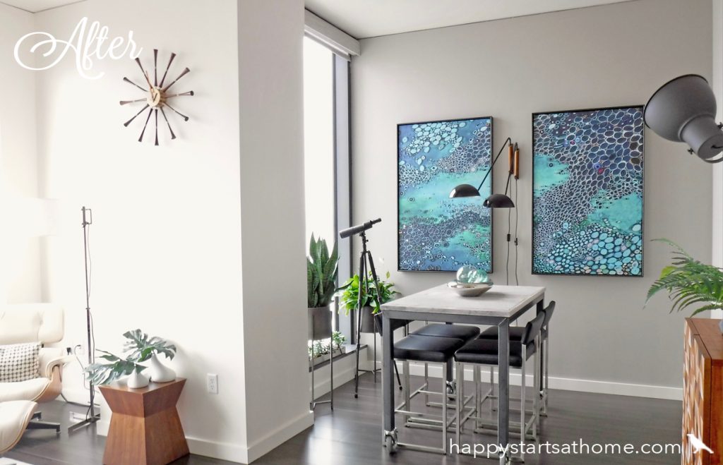
We solved that dilemma in the dining area with two very cool wall-hung lamps that reached out over the table. Then we filled the wall with art by buying one large canvas and having it cut and framed as two pieces, flanking the lighting installation. This brought both color and light over into the dining room to show off the marble and steel table, and created a great focal point for the entire living space (without taking away from the clean design or great view)!
Now that we had a design plan for the living and dining room, we needed to create a charming bedroom out of a windowless white box of a room.
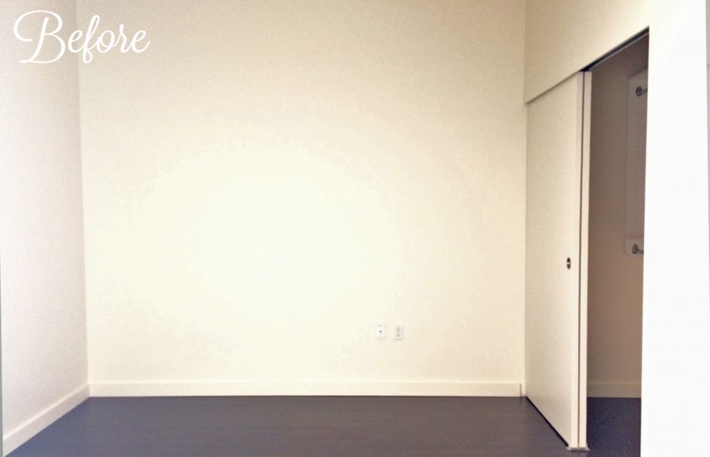
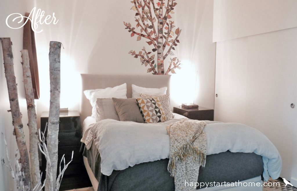
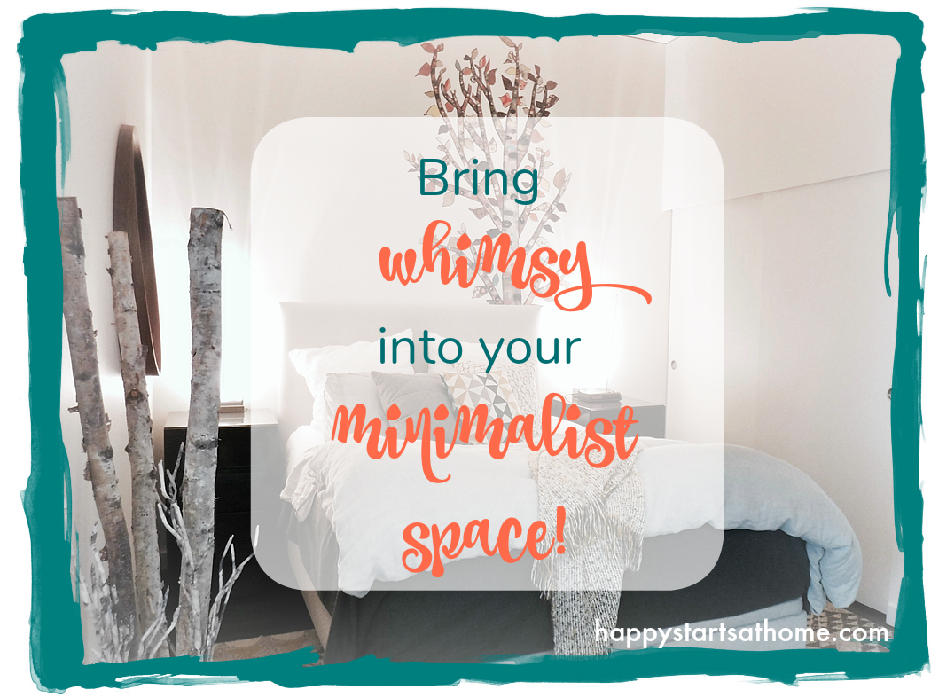
I had a plan, and it was entirely inspired by Halpern’s Lone Birch Tree wall mural. The only problem was that the tree mural wasn’t tall enough to really fill the 10′ tall space. My solution? Have it grow up from behind the headboard!
Everything else was born from this beautiful birch, supported by delicious textural elements in the linens, rug, headboard and pillows. Darker nightstands flank the flax-colored headboard and anchor the room, and minimalist lights brighten up the whole space. It’s a wonderful balance of sleek and natural, a perfect northwest room!
Have a small space that needs some personality? We’d love to help! Give a shout when you are ready to give your life a new chapter whether that’s in one room, or the whole house.
MAY YOUR HOME ALWAYS BE HAPPY!

Are you ready for a seriously happy home?
(Cue the confetti!)

Eager to get happy at home right now?
