A Tiny Bathroom Fit For Two
This tiny bathroom was a hazard for the couple who lived here! They both used this space to get ready every morning, but it only had a sink for one person, and the clawfoot tub – already on its last legs – was absolutely *not* suited for aging in place! Yikes!
Our job was to improve the layout while staying *in* the existing footprint, maintain the glass block window and, while we were at it, fill it with delightful color to compliment their newly remodeled kitchen (which you can see here! 😀).
Here’s what we were working with:
– Bathroom Before –
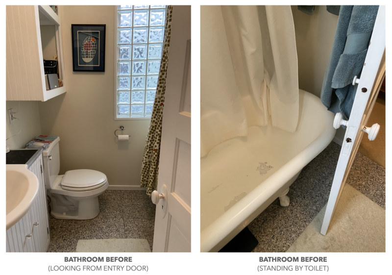
Yes, we could have had the clawfoot refinished, but it wasn’t a good use of space and was dangerous to get in-and-out of every day for showering!
Since it’s tricky to photograph a tiny bathroom, here’s a before and after of the layout of the room to give you a sense of the space:
– Bathroom Layout Before & After –
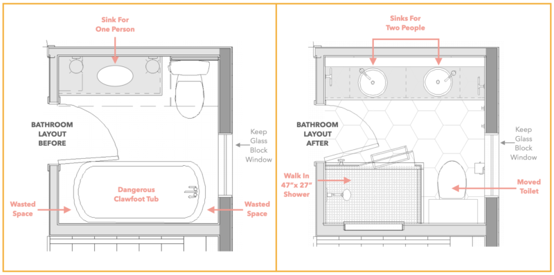
The clients were surprised and excited to learn that even if we moved the toilet across the room, we’d still have enough room for a nearly 4’ wide shower! It’s cozy from side to side at just 27”, but the clear glass shower enclosure makes it feel spacious, and the 47” from end to end give the homeowners plenty of room to spread their elbows while shampooing. Here’s a comparison shot from the entry showing the before and after:
– Bathroom Before & After –
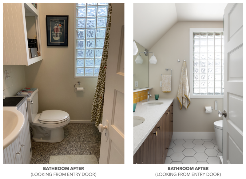
What a difference! Extending the vanity along the whole left wall means two people can comfortably get ready in the morning together – so great! In the next shot you’ll see some of the tricks we used to make this bathroom live larger than its tiny footprint, but in the shot above, notice how we used towel hooks to the left of the window instead of towel bars – that’s a great way to store your towels when your wall space is limited!
So what were some of the other tricks we used to maximize this tiny bathroom?
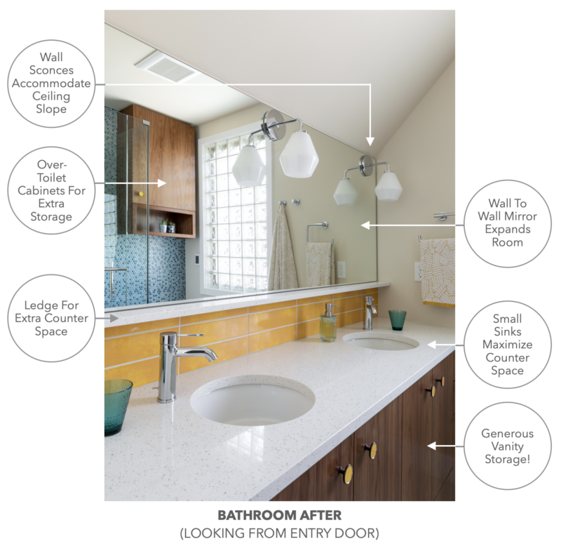
– Bathroom Details –
Lighting Tricks
Not only did we have to figure out a great floor plan for this tiny bath, we also needed to figure out how to light the bathroom mirror while accommodating the sloped ceiling. Downward-pointing wall sconces offered the perfect solution, giving great light without feeling crowded against the ceiling. (It’s the best way to light a bathroom mirror anyway – side sconces give *much* better bathroom light than overhead fixtures!💡) We wanted a full, border-free mirror to give the impression of a bigger room, so we embedded those lights directly into the mirror, and we set the mirror over a little quartz ledge to provide a bit of extra counter space.
Sinks for Two
Having two sinks was high on the client’s wish list! Since we only had about 18″ of depth to work with, and most off-the-shelf vanities are 20-22″ deep, we designed a wall-to-wall custom walnut vanity and found petite sinks to fit the shallower-than-normal vanity and maximize counter space. Then we offset the single-hole faucets so that 1) they wouldn’t be impeded by the ledge and 2) there would be plenty of space to install them given the shallower-than-normal vanity depth. Last but not least, we added a matching walnut cabinet over the toilet for bonus storage, embedding an outlet on the open shelf for the client’s Bose speaker system. Now they have SO much more storage than before!! 🙌
The other side of this cozy bathroom was nearly impossible to photograph effectively, so our brilliant photographer Julie Mannell shows it to us here in the reflection of the vanity mirror:
– The Colorful Back Wall –
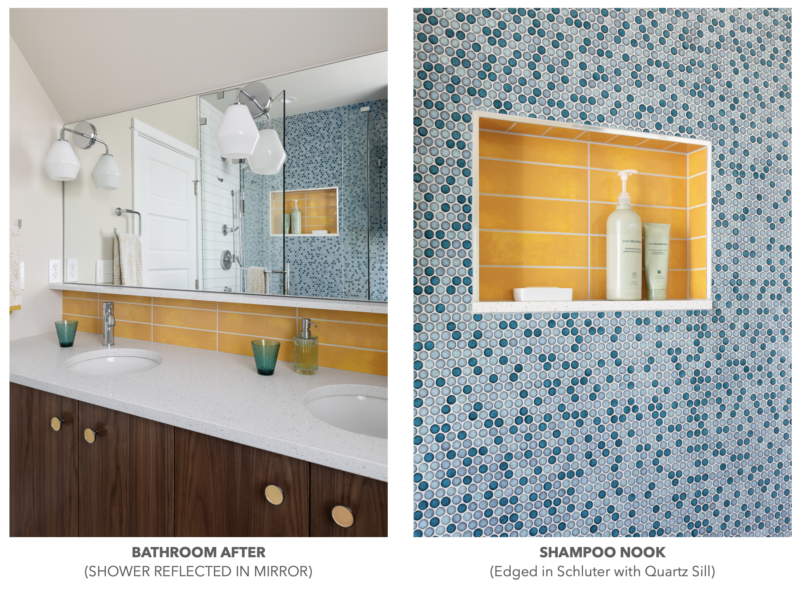
The clear glass shower enclosure makes the boundaries of the shower practically disappear, showing off the full wall of variegated blue penny tile and pop of sunshine yellow in the shower niche, repeating the happy color from the vanity backsplash. You might notice that the blue tile covers the whole wall, both in the shower and behind the toilet… Bringing the tile across the whole wall, instead of stopping at the shower glass, makes the room feel more expansive instead of chopped up, another trick to making a tiny room feel bigger!
By the way, a HUGE shoutout to the installation team at Raincap Construction – penny tile might be cost effective, but if it’s not installed well it can be a big ol’ mess, showing all the seams between the sheets of penny tile. 😩 Not here! The tile is beautifully and thoughtfully installed, and the schluter around the shampoo niche is perfect! (Note, if you’re building your own niche, we highly recommend using 2 cm quartz for the sill – it’s easier to clean than tile (no grout lines) and easier to slope forward into the shower (so you don’t end up with water trying to soak into the wall).)
We couldn’t feel more proud of this tiny bathroom remodel. From the smarter use of space, to the splashes of color that make the room shine without feeling crowded, this bathroom just makes us (and the client) seriously happy! 😀
Have a tiny bathroom that needs some smart design solutions? Or wish you had some color in your bath to chase away the gray days in Seattle? Our team is here help! You can consult with us during a Quick Action Session in your home to make sure your ideas are going to work great, or you can hire us to create an A-Z design plan though The Works (limited to 6-12 clients each year). Whether you work with us, one of our wonderful colleagues, or you DIY it, we hope your home makes *you* seriously happy!
MAY YOUR HOME ALWAYS BE HAPPY!

Are you ready for a seriously happy home?
(Cue the confetti!)

Eager to get happy at home right now?
