A Happy, Colorful Seattle Kitchen, Living Room and Bath
This Seattle kitchen remodel is a perfect case study of one of our “Collab” projects where we design side-by-side with our clients, helping them create their own happy home!
Like a lot of our clients, this homeowner had a good idea of what she wanted (she was a landscape architect and well-versed in design principles), but she didn’t have the time or resources to apply what she knew to the *interior* design of her home – where do you actually buy tile?
In just four meetings we measured the space, created the new layout for the kitchen, living room, and bathroom, and chose the materials for the kitchen, fireplace redo, and master bath refresh! We love making design feel easy and efficient!
The goal of this kitchen remodel was to make the room feel fresh, bright and functional, with cook and prep space for two cooks.
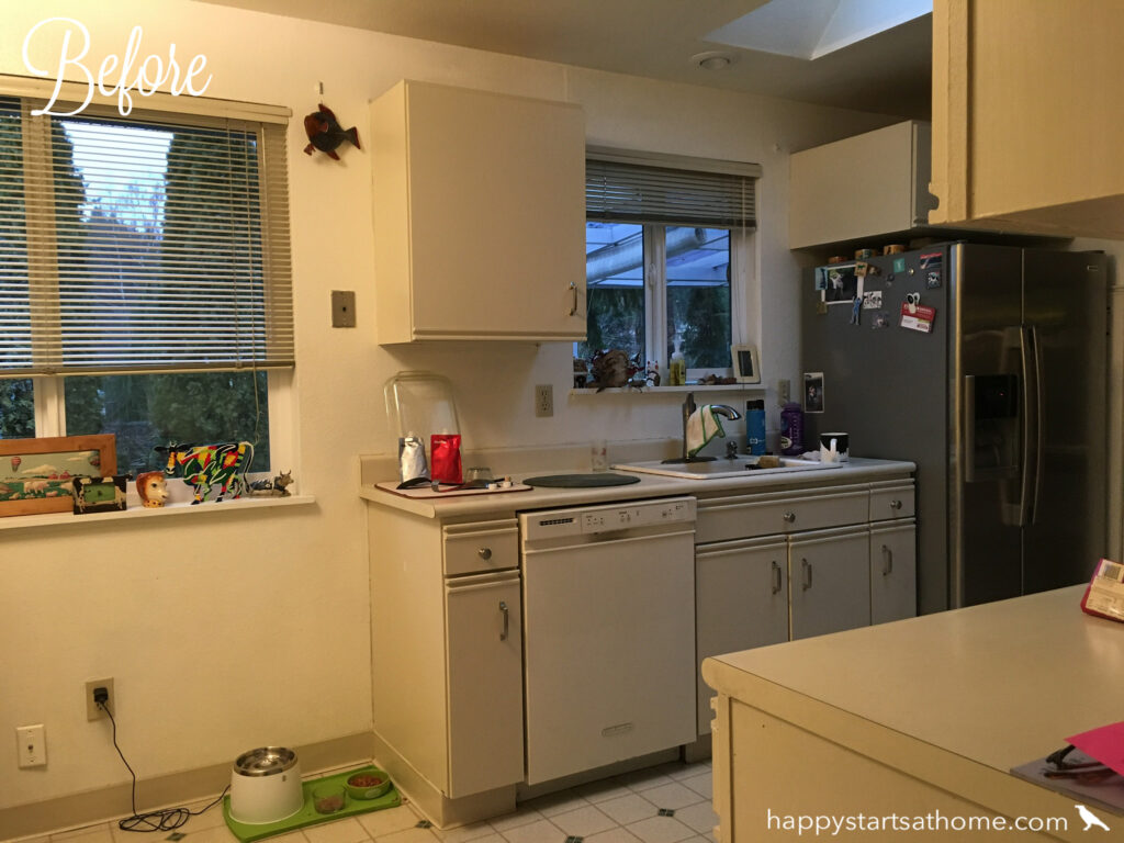
Before, the kitchen was contained to one side of the room, limiting the amount of functional counter space, and the cabinets stopped short of the ceiling, limiting the available storage:
After the remodel, the cabinets go all the way to the ceiling and the counters extend under the window, improving the use of the whole room!
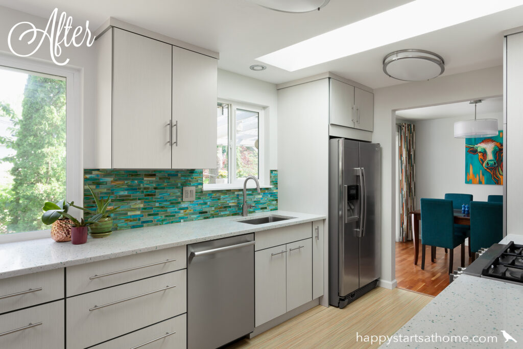
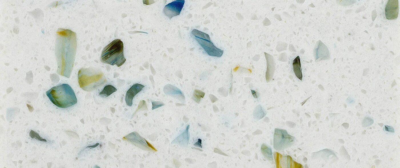
To add a splash of vibrant color we chose a glass tile mosaic (brilliantly installed by Greg Norman Tile & Design) and paired with quartz counters by Spectrum Quartz embedded with wonderful bits of teal and green glass!
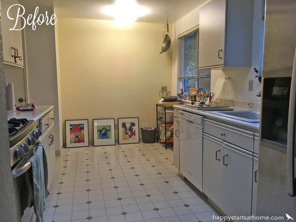
On the other end of the kitchen you can see all that wasted space (officially a small kitchen table would’ve sat here, but with the dining right off the other end of the kitchen, it wasn’t a good use of space for this family):
The client didn’t feel the need for any additional storage, and really wanted a bold feature wall to showcase her cow art and handblown pendant light, so we designed a floating eat-in counter that provided a perfect charging ledge and tucked away spot for feeding dog:
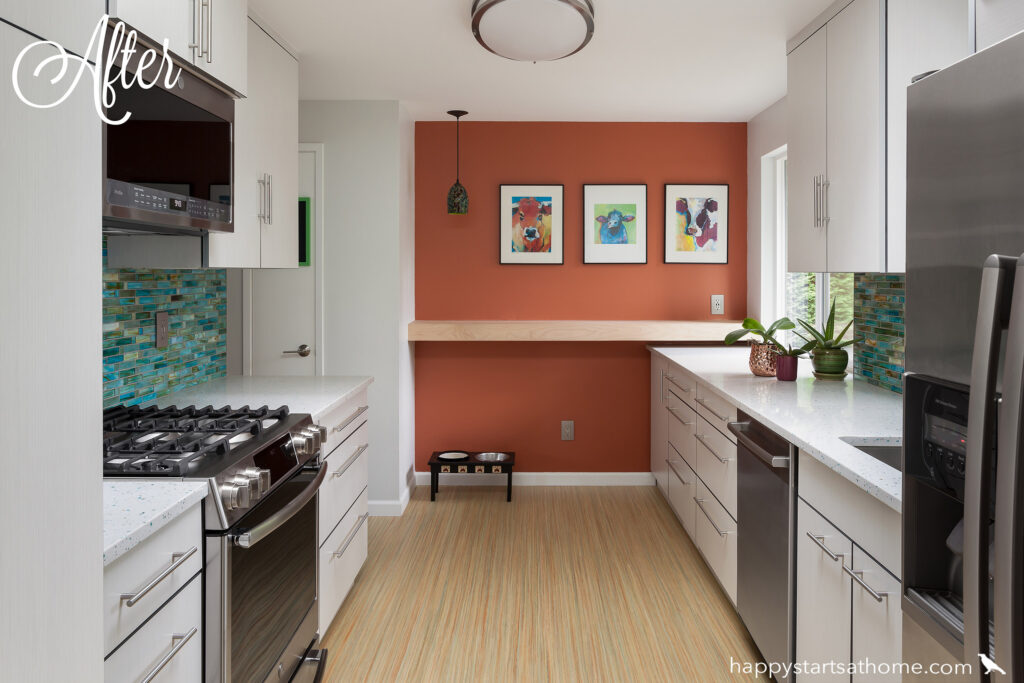
The whole room is tied together with Marmoleum flooring that also has accents of orange and teal – creating one of our favorite complimentary color schemes!!

Around the corner in the living room the client wanted to put a more modern spin on the plain brick fireplace and be able to reuse the existing hutch and bureau:
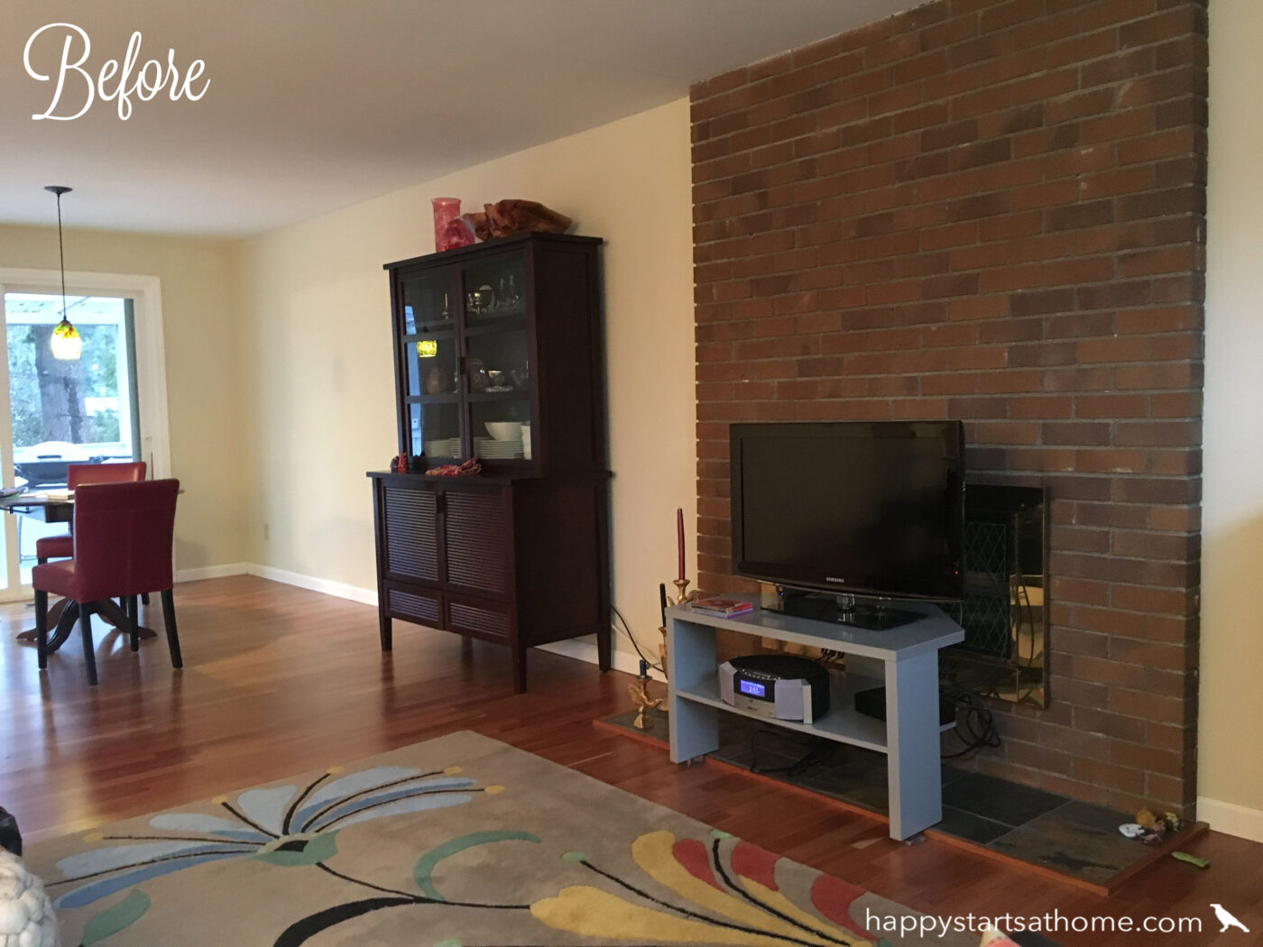
So we reclad the fireplace in rough-cut stacked stone tile punctuated by a chunky, clean mantle:
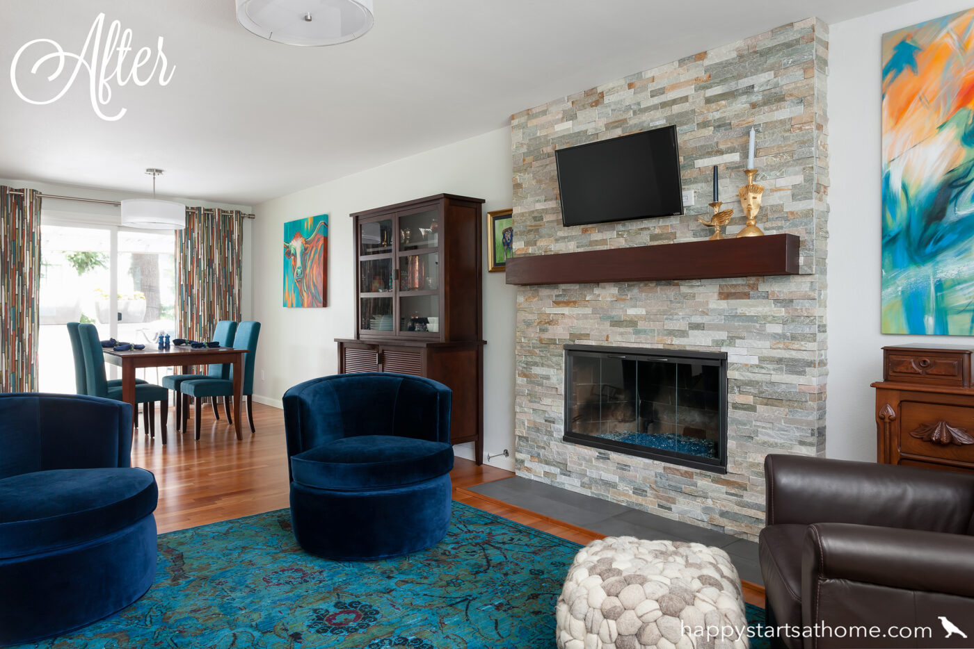
Doesn’t the old bureau and hutch look right at home in the new space!?
Last but not least we helped update the bathroom. Before it was straight out of the 80’s with a vanity that was actually open to the bedroom, and a separate shower/toilet room. We framed in a new wall to close off the vanity area from the bedroom and eliminated the wall between the vanity and the toilet:
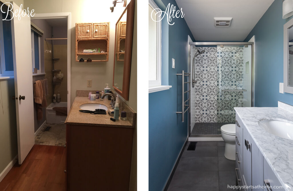
That made the bathroom feel *so* much more spacious and also let us create a fabulous feature wall of encaustic-style tile on the back of the shower – yum!
We LOVE transforming houses into homes! If a Collab sounds like just the design service you’ve been looking for, give us a shout! We’d love to help! And of course no project would be complete (or should we say, completed lol) without the magic of a great contractor, so a shout out is due to Mac Chambers and his team at Remodeling Chambers!
MAY YOUR HOME ALWAYS BE HAPPY!

Are you ready for a seriously happy home?
(Cue the confetti!)

Eager to get happy at home right now?
