A Colorful, Midcentury-Inspired Kitchen Remodel
This kitchen it hadn’t been updated in over 70 years – are you ready to see one of the most colorful remodels we’ve helped with to date? It’s *quite* the transformation! 😀
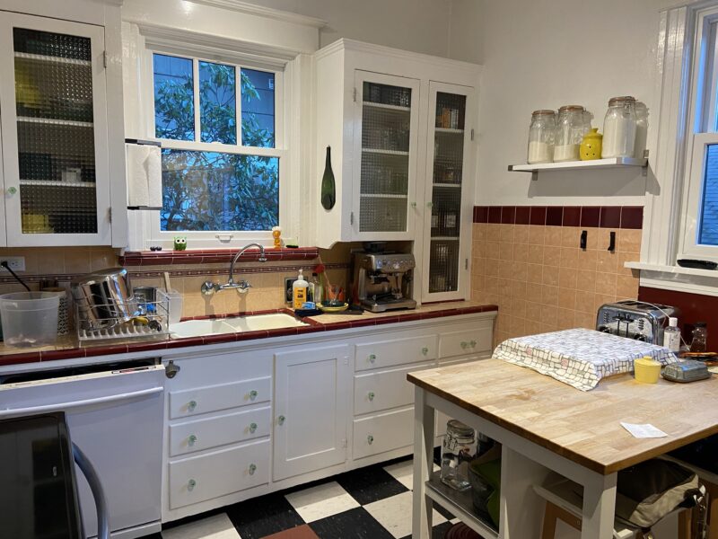
While the cabinets were handmade just for this space, the room just didn’t meet the function and storage needs of a modern kitchen. Worse, these neutral colors were *not* making our clients seriously happy. 🥺 They had a vision of an explosion of color – something that would evoke mid-century modern design, compliment their own collection of colorful dishes and Tiki glassware, and make them smile every day! 😀 Let’s see what we did…
– Kitchen Before –
– Kitchen After –
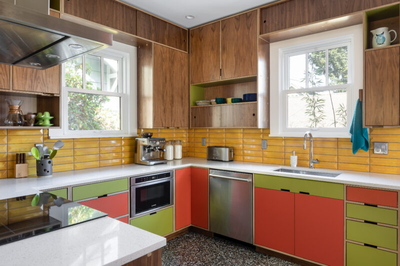
Yep! That’s the same viewing angle – we didn’t make any changes to the window locations in this remodel. But we *did* move the sink to the backyard window for a much nicer view while washing dishes, and made sure the new cabinets would go all the way to the ceiling! Of course, most of the impact comes from the color splash from the gorgeous Kerf cabinetry and deliciously textural yellow backsplash tile from Architectural Surfaces, all installed by the remarkable team at Raincap Construction.
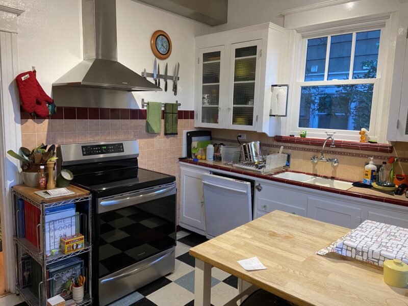
– Kitchen Before –
– Kitchen After –
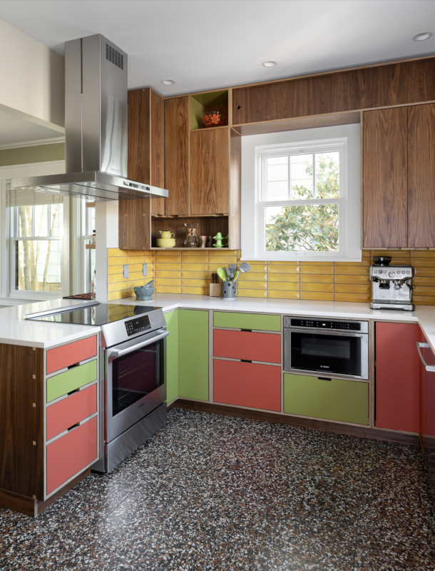
On the other side of the kitchen, the range and hood vent stayed in the same location, but we opened up the wall between the dining and kitchen, creating an open space floor plan *much* more conducive to entertaining – an important measure of success for these clients! The shot above also gives you a great view of the terrazzo-inspired floor tile!
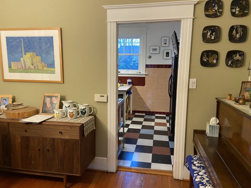
– Kitchen Before –
Here’s a view of the dining wall that used to keep the kitchen separate from the rest of the home:
– Kitchen After –
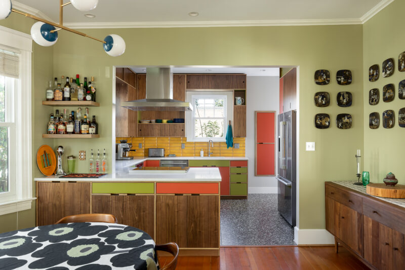
The newly opened wall makes the whole space feel light and spacious, and lets the homeowners enjoy their colorful new kitchen even when they aren’t using it! And check out those floating shelves tucked into the corner of the peninsula – a perfect bar area for mixing their favorite tiki-inspired cocktails! 🦜
– One of our Favorite Features –
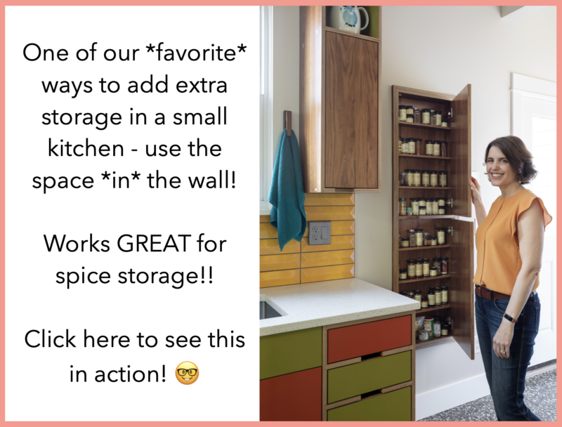
One of our most-favorite features is this in-the-wall shallow cabinet for hiding away the clients spices:
This is an *especially* great idea for tiny kitchens or passages – you get extra storage without crowding the space! It works just like an in-the-wall medicine cabinet in a bathroom, inset in between the framing in the wall. Note that this is a custom cabinet, but well worth the investment if you need to carve out that extra storage! Click here to see that cabinet in action!
– Beyond the Kitchen Before & After –
What about *beyond* the kitchen? This is the hall to the back door and adjoining bath/laundry:
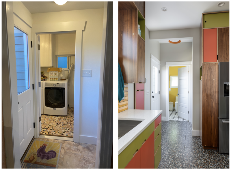
How tempting is that sunny yellow wall color, inviting you past the backdoor and into the completely reimagined bath/laundry space… and check out that fantastic light fixture on the ceiling of the backdoor vestibule – it doesn’t take a lot of color to make something sparkle! But you’ll have to stay tuned for the rest of the reveal – we’ll share the juicy transformation in our next portfolio post, you won’t want to miss it! 😉
Craving color in your future kitchen remodel? We’d love to help! You can either consult with us for 90 minutes in a Quick Action Session to work through your ideas and brainstorm solutions to your unique design challenges, or hire us to create an A-Z design plan through The Works. Whether you work with us or DIY it, we hope this inspires *you* to get happy at home! 😀
PS – like these photos? They were taken by the brilliant and talented Julie Mannel – if you ever need interior photos, we *highly* recommend her! 😊
MAY YOUR HOME ALWAYS BE HAPPY!

Are you ready for a seriously happy home?
(Cue the confetti!)

Eager to get happy at home right now?

